skip to main |
skip to sidebar
This was a note book I created adapting the brand to different material. THe A helps stand for architects and yet the a works as the strongest part of the logo.
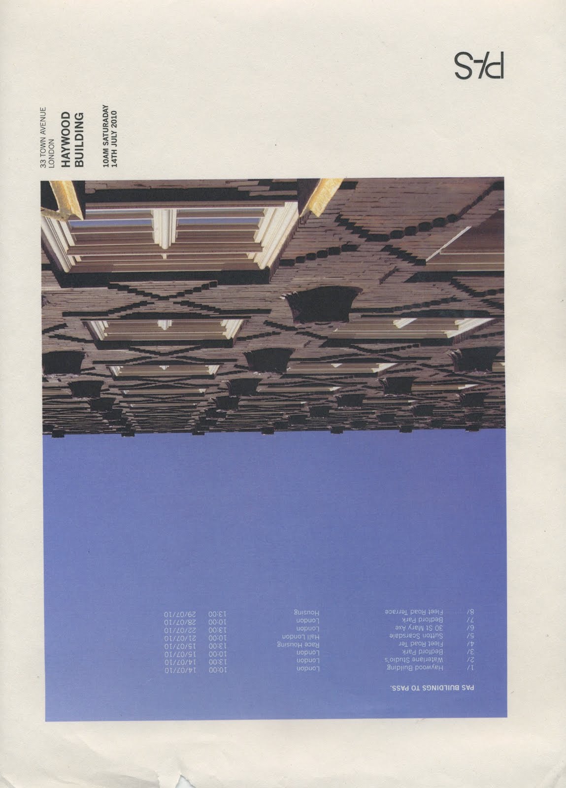
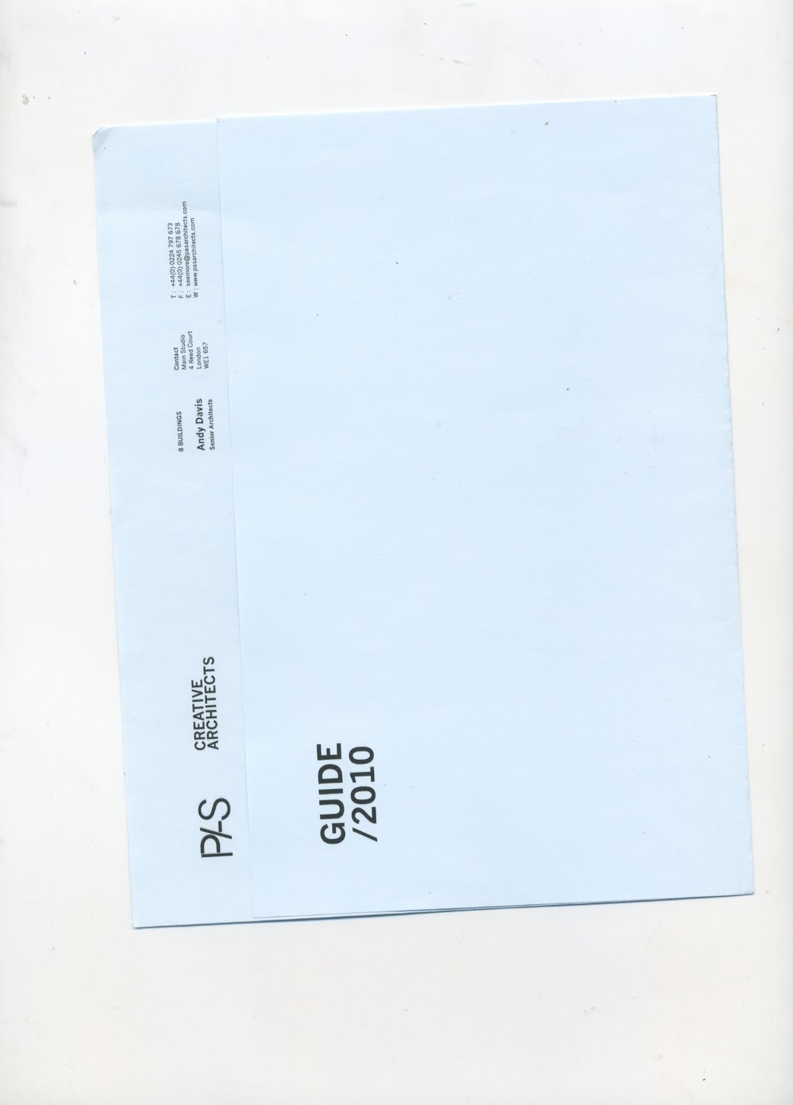
I came up with this final design after going back away from the computer and thinking about how the design should look and feel I wanted the booklet to look as interesting and contemporary as possible top show the creative agency with simple fold the design pushes through. The stock was specially orders from a paper stockiest back at home which I had to carefully arrange to get to leeds yet i feel the outcome prints well on the blue stock and keeps the brand consistent.




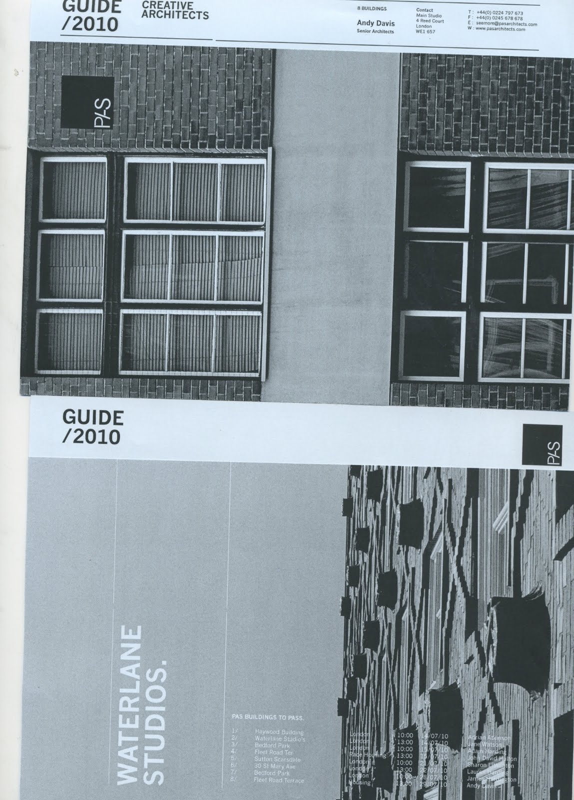
 I tested a range of different tests and layouts for the tour guide. Using the logo but ensuring that the outcome looked creative and interesting to open.


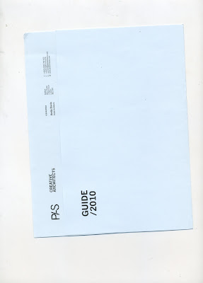

 With the new logo i tested a range of tour guides to hand out at the campaign with the new logo the logo stands out much better with and reads pas with the added line but still using only what is nessercery.


To extend the brief I thought about a tour guide and a campaign that would tour people around the buildings that pas had created. The logo is all joined currently with a thicker stroke to make the a stand out yet I still feel that it is not working.


Working with the development of the logo I tested how the logo would adapt to letterheads and promotional ideas working in a box still doesn't solve the problem of the logo reading as p/s. This still needs some development.


I have grown fond of the vibrant green which creates impact and a full exploration into colour however the colour is rgb and the green in cmyk is alot more dirty and nowhere near as vibrant. I could screen print the green however I will not have time and most of the facilities are booked up. Therefore i may have to think of a different option
Deciding on colour for this brief is a difficult task I am trying to push myself to use an interesting colour as am beginning to see my self wary of colour when i feel it should be explored. This blue i feel is still to safe
I need to use brighter colours that are more interesting and vibrant within my work. I am cautious of colour but the only way to learn is through playing with it.
I have started this new brief for pas architects this brief is not real but my criteria of what i want to test my self doing this brief could fit well. Pas are modern and contemporary and shows through their buildings. The company are efficent with smart thinking. The logo I devleopd shows thsi. The name I developed works well with arvchitecture as it can be shown through passing buildings. Whilst playing around with typography with anther own projecrt brief. I cam across the idea of putting the slas and the s to make the word pas which reads well with the logo. The brand may have to be developed with sefifs that might give the logo a development of the readalbility especially rom a distance yet thsi may interupt with the comtemporary style.