
The meeting yesterday went better than I expected the photographers liked the idea and the feel of the whole book it was exactly what they wanted combing powerful images with sophistication. They were talking of selling the booklet and so we thought of ideas to expand the idea to how it would be sold and how we could get the value up on the booklet.
I got the real contact information and so I will work up the idea with the correct copy and hi res images. I will also extend the poster range by doing poster series for each photographer.
Showing posts with label FMP Project Wednesday. Show all posts
Showing posts with label FMP Project Wednesday. Show all posts
Tuesday, 18 May 2010


promotional mail-shot test

Mailshot and general layout. the outcome printed onto 100gsm newsprint rough stock gives the images real subtlety but prints well and sits evenly on the stock.
Digital cover layout tests


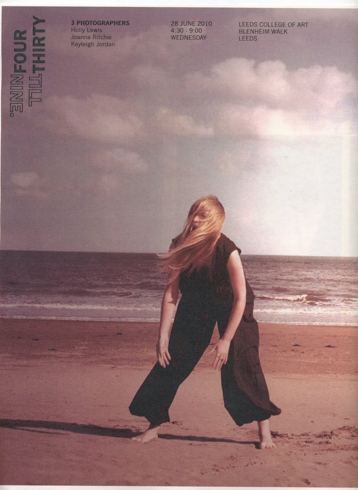
Testing the brand designs against the images and working up cover tests and ideas. I think that the image is very strong and sits well against the black I could extend the range suing other photographers and changing the colour of the logo depending on the image.
Fold worked up layout working test

Fold tests and development working with folds is testing and experiments pushing ideas and working with limitations.
New Cover idea

Another idea to bring across the 3 idea on the cover would make an interesting and impact.


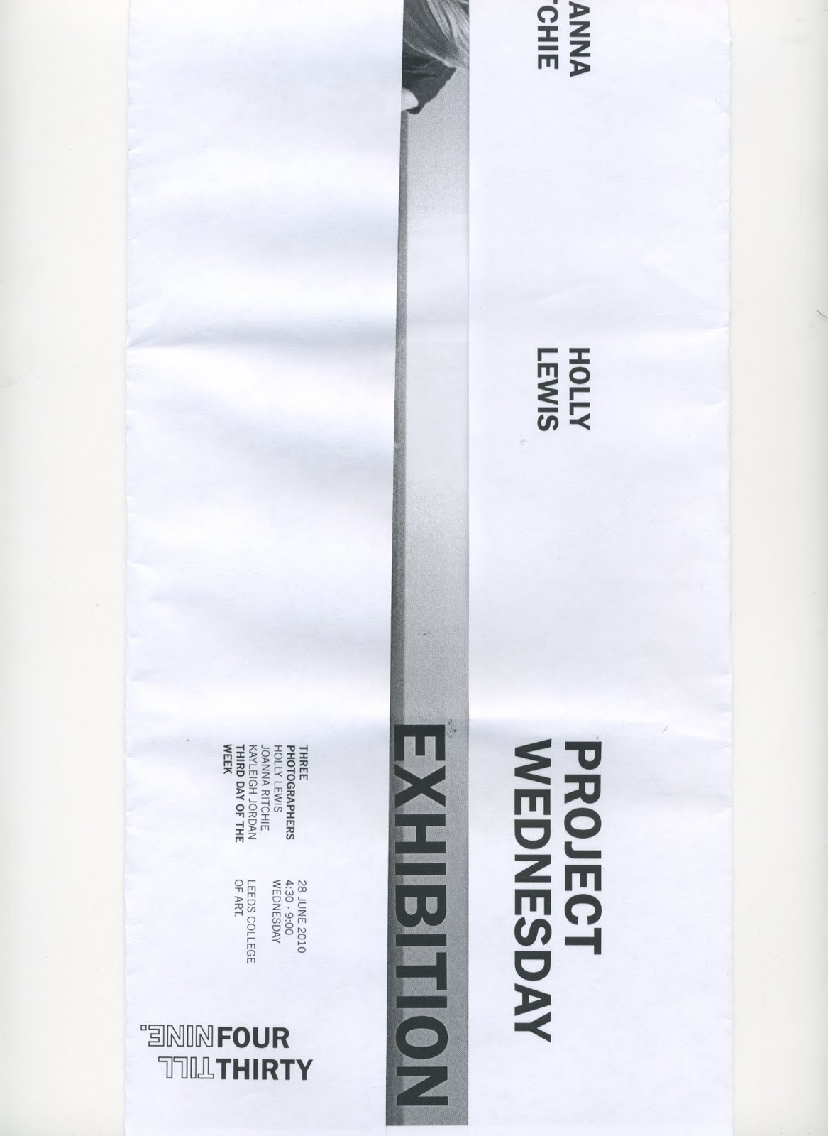
Book format test

To use my interests i played around with the format of the book playing with covers and the fold to bring across the 3 photographers to use this 3 photographers photographing on the third day of the week brings in the element of having three covers or playing around with the concept makes the outcome more interesting and playful.
Further tests


Playing with colour and reversing the four thirty and the til nine making day and night become apparent. The colour however of subtle pink is making the image look washy which is not what I am wanting and so a contrast of black may be stronger. Trying different shapes and inversing out.
Further development


Further tests playing with subtle colours and playing with time and the hand of the clock.
Fourthirtytilnine brand play


I started to play with block typography and see what would happen making words standout also playing with the time concept. I also played with the underlining but this si something that is becioming a trend inwhich I want to be different and Interesting.
Typeface brand test

I was looking at time and the position of the clock and how that would look as a logo. I feel that although on paper this shouldn't work but to have a logo teat is quiet bulky but simple would give the images a powerful but sophisticated based.
Project Wednesday ideas and brand tests


With a meeting with the girls they decided to change the name into four thirty till 9 this is when the n originally took the photographs the name of the group are project wednesday. I got the impression that vogue was a love of theirs and so I wanted to create something for them teat was sophisticated and as simple for them. The idea however I wanted to contrast and work with the subtle but powerful images.
Monday, 17 May 2010
Colour
I need to use brighter colours that are more interesting and vibrant within my work. I am cautious of colour but the only way to learn is through playing with it.
Subscribe to:
Posts (Atom)


