The Final Major project I ensured that I would challenge myself after preparing for how I would approach the fmp in my previous design practice module. Learning from my previous mistakes helped base how I chose my briefs and why I chose my briefs for my fmp.
Overall I had 8 complete briefs yet I feel that the overall production could have been stronger. My weaknesses lie within attention to detail, yet focussing on briefs such as the yearbook and layout based briefs I am developing my skills within attention to detail, as I know that this is an area, which is highly employable which I quickly need to resolve. The yearbook was my overall brief where I learnt the most. Working closely with tutors who specialise in layout as well as working with the team. I learnt different skills fast. Such as photography which I always shy away from as well as developing my skills for layout. I also learnt the benefits for team work as this is something that I usually avoided as I would rather work by my self. Yet with the correct team, work outcome can be very strong. I also learnt not stay within my comfort zones. The builders tea brief was not something I would have not usually picked yet I took a risk on the brief with strong brand guides and loud playful language I could play more with the concept.
The system of working with 8 briefs was focusing in on one brief at points but when a brief got challenging and static I would go back to another brief and push that brief more. In the builder’s tea brief I found myself doing this a lot and although I was happy with the language and the concept of the brief I often found my self going round in circles with the brief. This is where I understood how valuable asking colleague and designers opinions where as design can be viewed in so may different ways.
I feel that overall my time management of the fmp was stronger in comparisons to other briefs. I often set my self competition briefs or live briefs where there were deadlines and so my work was to tightly planned to deadlines, which enabled me to work to a better time plan and not string out briefs for an unnecessary amount of time. I feel that some briefs where extended but others could have been extended more yet when creating my boards I did not want to put on unnecessary photo shopped images as I know this is a weaker part of my work and so I was more selective in how I presented my work on the boards. Yet I could have been more selective in what development work I submitted. The blog however I found very valuable to the development of the fmp and my work it enabled me to quickly evaluate my problems and how to resolve them.
I found working with paper stocks was an area I enjoyed as I enjoyed watching people interact and enjoy my work. Such as the Project Wednesday brief. I enjoyed watching people see how the design functioned. I feel I should have experimented more with print and learnt more about the subject. Yet within the yearbook this is an area within print that I learnt quickly dealing with printers and how to design realistically and to budgets.
Overall I feel as a designer the fmp has enabled me to develop as a designer there are issue that need to be quickly addressed, yet in comparisons to my previous submission I feel more complete in what I have produced. I have worked harder and management my time a lot better which has enabled me to have more complete briefs that a more considered to my audience and communicating a message through simple but clear design.
Friday, 4 June 2010
Thursday, 27 May 2010
Note book
This was a note book I created adapting the brand to different material. THe A helps stand for architects and yet the a works as the strongest part of the logo.
Tour guide Final
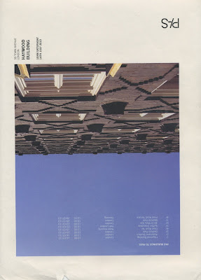
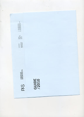
I came up with this final design after going back away from the computer and thinking about how the design should look and feel I wanted the booklet to look as interesting and contemporary as possible top show the creative agency with simple fold the design pushes through. The stock was specially orders from a paper stockiest back at home which I had to carefully arrange to get to leeds yet i feel the outcome prints well on the blue stock and keeps the brand consistent.
Wednesday, 26 May 2010
Tour Guide tests
Sunday, 23 May 2010
Tour guide tests
Saturday, 22 May 2010
Logo development tour guide idea
Subscribe to:
Comments (Atom)


